



How to build an industrial product comparison chart that speeds up vendor selection




How to build an industrial product comparison chart that speeds up vendor selection
An effective industrial product comparison chart does more than collect specs in one place. It helps procurement teams separate real fit from sales language, compare vendors on the same terms, and shortlist options without losing time in back-and-forth clarification. If you are buying cooling systems, compressed air equipment, vacuum solutions, or heat exchange technologies, the chart should answer one simple question: which vendor is most likely to meet the job with the lowest sourcing risk and the clearest lifecycle value? The mistake I see most often is this: teams build a chart that looks tidy but does not support a decision. It lists model names, catalog numbers, and a few headline numbers, then stops. That may help with recordkeeping, but it does not help you choose. A useful chart needs to reflect how industrial equipment is actually bought: by performance under real operating conditions, compliance, serviceability, energy use, lead time, and the cost of living with the equipment after installation.Start with the decision, not the spreadsheet
Before you build the chart, define the decision it has to support. Are you trying to eliminate vendors that cannot meet a process requirement? Are you ranking similar products for final negotiation? Are you trying to compare a local supplier with a global brand that has better service coverage? That matters because the structure changes. For early screening, you want hard pass/fail filters: capacity range, operating pressure or temperature, duty cycle, materials, certifications, and installation constraints. For final selection, you need weighted comparison: energy consumption, maintenance interval, spare parts availability, warranty terms, response time, and total cost of ownership. A good chart mirrors that sequence. It does not try to do everything at once.Use categories that buyers can actually defend
The best industrial comparison charts use categories that are easy to explain to engineering, finance, and operations. The point is not to create more columns; it is to create columns that reflect procurement risk. At minimum, I would separate the chart into these groups: - Technical fit: capacity, range, materials, footprint, compatibility with existing systems - Operating cost: energy use, utility demand, consumables, maintenance frequency - Commercial terms: price, delivery lead time, payment terms, warranty, after-sales support - Risk and compliance: standards, certifications, safety documents, export restrictions, service network - Vendor capability: references, application experience, spare parts supply, technical response time That structure works because it tracks how industrial buying decisions are usually made. A vendor may look cheaper on unit price and still be the wrong choice if maintenance support is weak or the equipment consumes far more energy in continuous operation.
Separate must-have requirements from comparison criteria
This is where many charts get messy. Teams mix mandatory requirements with ranking criteria, then wonder why the decision keeps changing. Mandatory items are the non-negotiables. If a vendor fails them, it is out. Examples include: - Required flow rate or thermal load - Permitted noise level or cleanroom compatibility - Local electrical standard - Required materials for corrosive environments - Compliance documents needed for regulated sites Comparison criteria are what you use when several vendors pass the gate. Examples include: - Energy efficiency - Maintenance access - Documentation quality - Lead time - Service coverage - Flexibility on customization If you keep those two layers separate, the chart becomes much easier to use. It also reduces the common political problem where a weak vendor tries to compensate with a low price after failing core technical needs.Make the chart reflect real operating conditions
A comparison chart is only useful if the inputs are credible. Industrial products often perform differently depending on load profile, ambient conditions, fluid quality, contamination risk, and operating hours. A compressor that looks efficient on paper may be a poor fit for a facility with variable demand. A heat exchanger that is technically adequate may still create downtime if cleaning access is poor. This is why buyers should ask vendors for data tied to actual use conditions, not just brochure conditions. If you are comparing compressed air systems, ask how performance changes under partial load. If you are comparing cooling or heat exchange equipment, ask what assumptions sit behind the rated capacity. For vacuum solutions, ask how performance holds up over the duty cycle you really run, not the ideal one on the datasheet. The chart should preserve those assumptions in plain language. Otherwise, you end up comparing numbers that are not truly comparable.Score what matters, but do not fake precision
Weighted scoring can be useful, but only when the weights are defensible. A common error is to assign a neat percentage to everything and pretend the result is objective. It is not. The score is only as good as the logic behind it. In practice, I suggest using three levels: 1. Pass/fail for compliance and basic technical fit 2. Weighted score for operational and commercial criteria 3. Reviewer notes for anything that needs judgment That last part matters more than people think. A chart that includes short notes such as “service team confirmed local spare-part stock” or “lead time depends on imported control panel” often helps more than another decimal place in the score. Procurement is not only about calculation. It is also about preserving the reasons behind the choice so the decision can survive internal review later.Watch for the numbers vendors like to highlight
Industrial suppliers usually lead with whatever makes them look strongest. That is normal. Your job is to test whether the headline number hides a cost elsewhere. A low initial price can be offset by higher energy consumption, shorter service intervals, or expensive proprietary consumables. A strong efficiency claim may depend on test conditions that do not match your site. A fast delivery promise may exclude custom options or final documentation. A broad product range may look impressive, but it can also mean the specific model you need is less mature. This is where a disciplined industrial product comparison chart helps. It forces the conversation from sales claims to decision evidence.Where GTC-Matrix can be useful
For teams working in industrial cooling, compressed air, vacuum processes, and heat exchange technologies, GTC-Matrix is the kind of intelligence source that can support the upstream part of selection. Its coverage of thermodynamic logic, compression systems, and heat exchange trends is useful when a buyer needs to understand which technical path makes sense before narrowing vendors. That does not replace vendor due diligence. It does help procurement teams frame the comparison correctly, especially when the buying decision touches energy efficiency, decarbonization goals, or process stability in industries such as pharmaceuticals, semiconductors, and food production. In those cases, the comparison chart should be built around operating reality, not only purchase price.What a strong comparison chart looks like in practice
A useful chart usually has one page for the shortlist and one attachment for detail. The shortlist page lets stakeholders see the decision fast. The detail page keeps the evidence. For example, if you are comparing three heat exchange vendors, the shortlist might show capacity range, material compatibility, footprint, delivery time, warranty, service coverage, and total score. The detail sheet would capture the operating assumptions, certification documents, exclusions, and any open questions. That split is practical because senior stakeholders rarely need every technical line item in the first meeting. They need a clear view of who is still in the running and why. Engineers, on the other hand, need the detail before final sign-off. A good chart serves both without becoming unreadable.Common mistakes that slow vendor selection
The biggest mistake is comparing vendors with different assumptions. The second is giving too much weight to price. The third is letting the chart fill up with empty fields because nobody chased missing data. Another common problem is over-customizing the chart for one project until it stops being reusable. A better approach is to keep a stable core template, then add a small number of project-specific fields when needed. That way, your team can compare suppliers consistently across categories instead of rebuilding the logic every time. One more thing: do not let the chart become a substitute for supplier conversation. It should sharpen the questions, not replace them. If a vendor cannot clearly explain energy performance, service model, or compliance documents, that is a signal worth recording.Use the chart to shorten the path, not to pretend the choice is simple
The goal of an industrial product comparison chart is not to remove judgment. It is to make judgment faster and more reliable. For procurement teams, the chart should expose technical mismatch early, show the real cost of ownership, and make vendor tradeoffs visible before negotiation gets expensive. If you build it around mandatory requirements, operating conditions, lifecycle cost, and support capability, it will do real work. If you only copy brochure specs into columns, it will look polished and still fail the main job: helping you choose the right vendor with confidence.FAQ
How many vendors should I include in an industrial product comparison chart?
Usually three to five is enough for a serious shortlist. More than that, and the chart becomes harder to maintain and harder to defend.
Should price be the first column in the chart?
No. Price matters, but it should not lead. Start with technical fit and compliance, then compare commercial terms after the basics are cleared.
Can one chart work for compressors, cooling systems, and heat exchangers?
The structure can be shared, but the technical fields should change by product type. Reuse the framework, not the exact column set.
What is the most overlooked field in a comparison chart?
Service and spare parts support. Many buyers only check it late, after the shortlist is already too narrow.
Should I ask vendors to fill in the chart themselves?
Yes, but verify the data. Vendor input is useful for speed, not for final trust.
Image Placeholder Notes
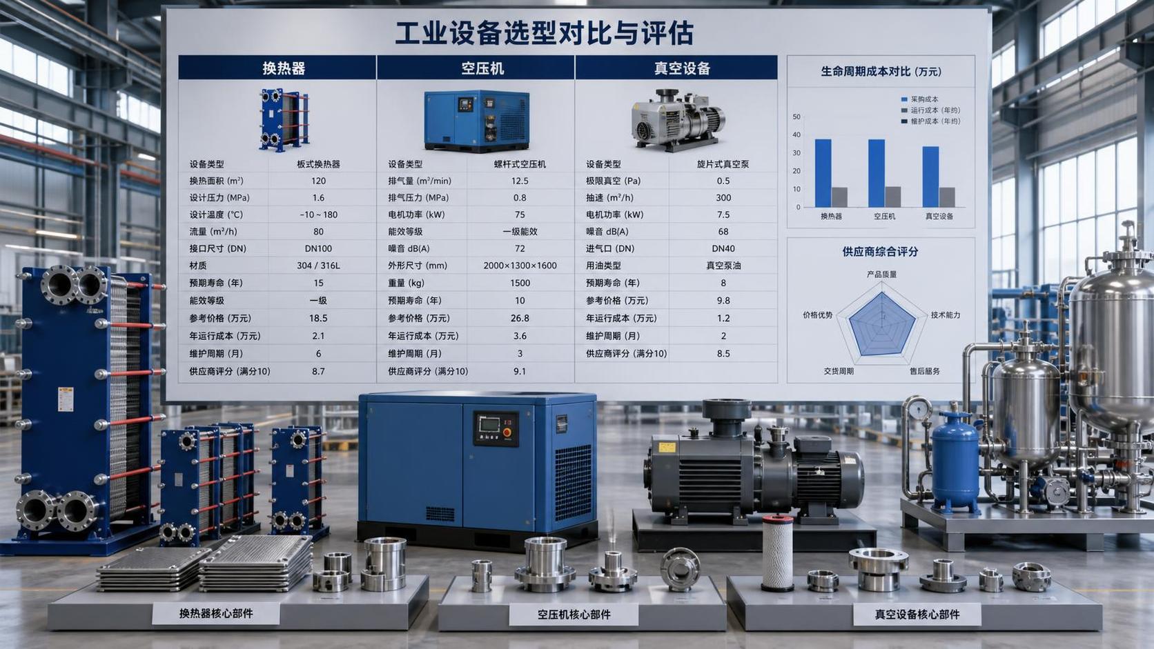
- `` - Suggested placement: near the section on categories and decision structure - Content: a sample industrial product comparison chart with technical, commercial, and risk columns - Alt text: industrial product comparison chart template for vendor selectionInternal Link Suggestions
- industrial cooling system selection guide: product category guide - compressed air equipment lifecycle cost analysis: procurement decision page - heat exchanger specification checklist: technical evaluation resource - supplier qualification checklist: vendor risk management page - industrial maintenance planning framework: operations planning articleExternal Source Directions
- industry association standards and guidance pages - government procurement or regulatory compliance pages - manufacturer technical documentation and application notesSEO Self-Check
- Meets selection / decision intent: yes - Fits evaluation-style article: yes - Written for procurement readers: yes - Main keyword appears naturally: yes - Keyword stuffing avoided: yes - Template-like AI phrasing avoided: yes - Structure has natural variation: yes - Unverified factual claims included: no - GTC-Matrix information integrated naturally: yesRelated News
- Which industrial solution comparison criteria prevent project delays?Author :

- What to evaluate before choosing a thermal process engineering supplierAuthor :

- How industrial utility systems affect energy costs in process plantsAuthor :

- What Data Is Needed to Assess Heat Recovery Decarbonization?Author :

- Can Waste Heat Recovery Support Carbon Neutrality Targets?Author :

- Is Compressor Heat Recovery Worth the Installation Cost?Author :

- What to verify before choosing a process separation technology supplierAuthor :

- When does process utilities engineering reduce project rework?Author :

- Where thermal efficiency optimization delivers the fastest savings in EuropeAuthor :

- What should you verify before selecting a heat transfer supplier?Author :

- What drives compressed air systems price for industrial projects?Author :

- How an industrial product knowledge comparison guide reduces sourcing riskAuthor :

- When does a procurement specification planning process reduce bid risk?Author :

- When does thermal system optimization for electronics reduce failure risk?Author :

- When high temperature process heating systems justify the higher energy costAuthor :

- How to compare sludge dewatering equipment by cake drynessAuthor :

- What to Check Before Sourcing a Gas Turbine for Distributed Power ProjectsAuthor :

- What drives industrial thermal systems price in large facility projectsAuthor :

- How to build an industrial product comparison chart that speeds up vendor selectionAuthor :

- Vacuum Technology Application Guide for Selecting the Right SystemAuthor :

- What Drives Vacuum Drying Cost in Industrial Procurement?Author :

- What Drives Compressed Air Pricing in Industrial Systems?Author :

- How Procurement Specification Planning Shapes Total Project CostAuthor :

- Compression Technology Guide: How to Compare Efficiency, Pressure Range, and Maintenance NeedsAuthor :

- How to Compare Industrial Separators by Throughput, Purity, and Maintenance LoadAuthor :

- How to Size a Compressed Air Equipment Receiver Tank for Stable PressureAuthor :

- Industrial Equipment Selection Guide: How to Compare Capacity, Duty Cycle, and Operating CostAuthor :

- How to Evaluate an Intellectualization Supplier for Industrial UpgradesAuthor :

- High-Efficiency Manufacturing: Cost Savings vs. Upgrade RiskAuthor :

- Thermal System Optimization Cost: What Drives ROI?Author :

- How to Plan Process Utilities for a Cleanroom Without Costly ReworkAuthor :

- How to Compare Process Heating Suppliers in MexicoAuthor :

- Food Processing Utilities: Common Sizing Mistakes That Raise Energy and Water UseAuthor :

- How to Build Procurement Specification Planning for Industrial EquipmentAuthor :

- OEM Cooperation for Industrial Equipment: Risks, Terms, and Cost PrioritiesAuthor :

- Specification-Oriented Product Resources That Speed Technical ReviewAuthor :